Share:


Nine words branding designers use that are often misunderstood by their clients
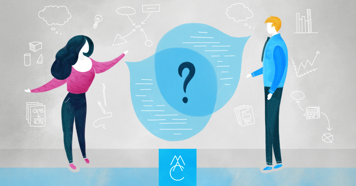
It happens all the time. In just about every meeting with every client there’s a point when words stop working as expected. You say one thing; your client hears another.
Miscommunication with clients is particularly frustrating because as branding designers we are in the business of communication. We pride ourselves in our ability to simplify the complex. We leap at the challenge to transform a mess of disjointed inputs into an elegant output. We labor long hours, fine-tuning our client’s communications in order to ensure their message is easy to understand and easy to act upon.
But then, inevitably, it happens. While you’re pitching that all-important big idea to a new client—or even just trying to describe the thing on your screen to someone over the phone — the understanding of a word gets in the way.
It happened the other day at our office. A couple members of our design team were meeting with an important client who works in the online security space. Our work for this client includes the development of a branding toolkit that includes about thirty icons for them to use in presentations and on their website. In addition to this expansive set of simple icons, we’re also developing a handful of more detailed illustrations for their website. These larger illustrations are being used to support paragraphs of written content about our client’s services and target industries. Together, the icons and illustrations come together to form an infographic we’re designing to communicate the various methods and tools our client uses to keep the Internet safer for everyone.

Problem was, several words kept getting mixed up as our conversation with the client bounced around between different pages of the website and other branding elements we were discussing. When one of our designers began talking about adding texture to the illustrations, it took a minute to realize the client was actually talking about the iconography. And when someone on the client side mentioned the logo could be bigger, we suggested increasing the logotype but keeping the size of the logo’s icon unchanged, given the space restraints. Now wait, which icon are we talking about again?
Backtracking to untangle the word jumbles cost everyone in the meeting extra time and resulted in a wee bit of frustration on my part. But the problem wasn’t a lack of listening. The problem was a lack of agreement about what these words meant by those sitting around the table.
So I asked myself: What could we have done better, in advance of this client review meeting, to make sure everyone was in agreement on the basic definition of terms?
One way could have been through the development of a more comprehensive brand book. In fact, whenever a client hires us to develop a branding system we always recommend including an identity guide or brand book as part of our deliverables. Whether it’s just a few short pages (we call this an identity guide) or something longer and more elaborate (we call this a brand book), the document is a valuable tool that can — when done correctly — improve communication between our firm and the various stakeholders on the client side.
The brand book we initially created for the client described above included some information about the various types of artwork we developed. Unfortunately, we missed an opportunity to clearly define the difference between “icon” and “illustration.” These are illustrations. Those are icons. This is how we use the illustrations. That is how we use icons.
An early draft of the brand book didn’t do this, but we’re now updating the document to make sure everyone is on the same page.
Top nine offenders
Another way to get in sync with a new client is to give them a list of branding terms, with definitions, that you anticipate will be used during your time of working together. Best to do this early in the process — well before you start designing anything.
Below is a list of nine words, with definitions, that in my experience get used (and misused) most often when branding designers and their clients attempt to communicate.
1 | Brand: A brand is a noun. It’s a thing. More specifically, a brand is how someone might describe your organization’s reputation. It’s what your customers think or feel when they think of you. Example: Apple’s brand is about style, while Dell’s brand is about … meh.
2 | Branding: The ing tells us that branding is an action. Developing your organization’s logo is an act of branding design. Likewise, the act of applying your brand identity elements (your logo, color palette, fonts, etc.) to say, a brochure or a website, is an act of branding application.
3 | Logo: Unless we’re specifically talking about the mark a branding iron burns into the hide of cattle, your logo is not your brand. Conversely, your brand is not your logo. These two words shouldn’t be swapped around willy nilly. A logo is a distinctive visual mark that represents a brand. It visually identifies the brand in a similar way that a name, when spoken, audibly identifies the brand. Most logos include two elements: 1) typographic letterforms called a logotype; and 2) an illustrated component called an icon.
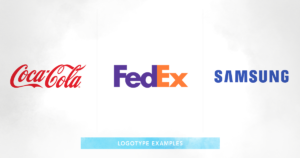
4 | Logotype: The letterforms of a logo, especially when distinctly designed to represent your brand, are called a logotype. Examples of stand-alone logotypes are Coca-Cola, FedEx, and Samsung. Another word for logotype is wordmark.
5 | Icon: If your logo has an illustrated component that is separate from its letterforms, this part of the logo is often called an icon. It generally will communicate a singular idea, although designers often enjoy packing multiple (sometimes hidden) meanings within a single icon. Synonymous terms are symbol and mark. My advice: whatever word you choose, pick one and stick to it. Big brands with household names like Nike, Apple, and McDonald’s can get away with using an icon alone as a recognizable substitute for their full logo. In these instances, the icon may be referred to as a brandmark.
6 | Iconography: A collection of icons — separate from the logo— used within a brand’s visual identity system can be referred to as iconography. A defining characteristic of the individual icons is that they’re simple. Iconography, therefore, is a set of simple illustrated icons.
7 | Tagline: This is a descriptive statement. It’s a short, useful phrase that’s tagged onto your logo. Its purpose is to describe what your organization does, how people can benefit from your services, or something else that differentiates your organization from others. Below is a logo and tagline developed by the MAC for a company that produces heirloom-quality furniture with a lifetime warranty.
![]()
8 | Slogan: This is a marketing statement. There are significant differences between a slogan and a tagline, which I’ve written about in more detail here. Slogans are catchy phrases you could lead marketing campaigns with, and when at their best will make you feel something. Many big brands will change their slogans often (remember Food, Folks, and Fun?), but others (e.g. Just Do It) stick around for years.
9 | Lockup: When a logotype, icon, and tagline (or marketing slogan) come together as a single piece of artwork — and delivered say, as a single JPEG or EPS file —you’ve got yourself a lockup. This word can also be used to describe multiple logos, such as a parent company logo and a sub-brand logo, that are used together.
Well, those are the big ones. Did I miss something from your list of misunderstood design terms? Feel free to copy/paste the definitions above and drop them onto your own company letterhead. Then, pass it around the table at the beginning of your next design review meeting.
This article is also published on Medium.
More Resources
-
Article
A better way to brand and market online degreesUniversities coast-to-coast are offering an ever-increasing number of degrees and certificates online these days (craft brewing or turf grass management,...
-

Article
Communicating with Diverse AudiencesIf your organization deals in community essentials such as education, healthcare, utilities, or transportation, you’re likely faced with a unique...
-
Article
How to Build Out Your Organization’s Sub-Branding StrategyDefining a ‘Sub-Brand’ Simply put, sub-brands are tools we use to organize our brands. But, before we can wade into...
