
Share:


Are breadcrumbs still fresh for UX?
For the better part of 16 years I’ve been designing websites and other screen interfaces, and during this time I have certainly seen an evolution in UX/UI design trends.
Technology has evolved, too. It wasn’t all that long ago when mobile phones, with their tiny screens, would only display tiny websites. As responsive layout became the norm, a whole new set of usability and wayfinding needs for mobile design was born.
And yet despite these changes and new challenges over the years, the job of the UX designer has remained the same: Present information in an easy-to-find, easy-to-consume way.
I’ve decided to take a closer look at one of the more ubiquitous interface design elements on the web — the breadcrumb trail — and ask a few questions. First, do website users actually find breadcrumbs useful? Second, if they are in fact helpful, what are some ways to optimize their effectiveness? And finally, will new technologies and trends in UX/UI design relegate breadcrumbs to the trash bin of antiquity? In other words, is modern web design causing breadcrumbs to go stale? Let’s find out.
A little history
Long, long ago when siblings Hansel and Gretel were abandoned in the woods by their extremely poor (in more ways than one) parents, they conceived a genius way to find their way back home: Drop breadcrumbs. Nevermind the fact that birds ended up eating the bits of bread, causing the two lost children to be kidnapped and nearly cooked by an old witch. The idea was still a good one: Leave a trail behind.
Fast forward to 1991, when The New Kids on the Block were rocking the Super Bowl halftime show. Web servers and web browsers were the new tech on the street, and it didn’t take long for developers to co-opt Hansel and Gretel’s brilliant wayfinding method for their own then-20th-century purposes. Digital breadcrumbs quickly became commonplace across the world wide web because they gave users a handy, at-a-glance view of their current location and a path to get home. 25+ years later, these strings of links, separated by arrows, continue to be ever-present on the Internet today.
By the way, I have a theory that the word itself was originally part of why breadcrumbs caught on within the designer/developer community. It was a memorable and clever metaphor, and became a sort of insider term for people who make websites. I suspect this sentiment hasn’t changed.
Usability begins with well-organized content
When we develop websites and applications here at the MAC, one of the early steps in our process is to analyze all of the site’s content, then map out every section and page into a well-organized tree diagram. Our recommendations are informed by the client’s goals, the end-user’s needs, and usability best practices. These information architecture (IA) diagrams typically start by showing the home page, then below that the major sections of the site, then the subsections, etc., and finally the individual content pages.
Here’s what the IA and corresponding breadcrumb trail for a website we recently developed for a local bank looks like: Home > Business > Checking & Savings > Business Checking Accounts.
Each level represents a click (or tap) by the user. Of course when breadcrumbs are clickable, as all good breadcrumbs should be, they give users another way to go “back” or “up” a level to explore other pages in the website. The one exception to this rule is the page at the end of the breadcrumb trail. The name of the page currently being viewed shouldn’t be a clickable link, as reloading the active page would just be confusing.

Above: Location-based breadcrumbs for Willamette Community Bank
Two kinds of breadcrumbs
There are two main breadcrumb types used in UX design today:
- Location-based: to help a user identify their current location in the site’s structure; and
- Attribute-based: to help a user identify an important quality or attribute of the content (page) being viewed.
The website above features a location-based breadcrumb trail. Now let’s take a look at a couple attribute-based examples. Amazon sells books in multiple formats including paperback, hardback, and Kindle — their digital reader version. For Amazon, a book’s format (printed or digital) and genre (there are dozens of them) are attributes significant enough to warrant their own system of breadcrumbs. Take a look at the two screen shots below. It’s the same exact book categorized in two completely different ways. When you toggle between “Kindle” and “Paperback” it reloads the page and changes the breadcrumb trail.
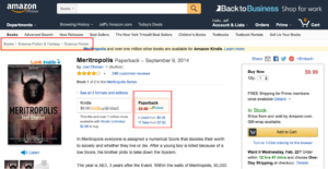
Above: Amazon’s breadcrumbs (paperback version)
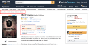
Above: Amazon’s breadcrumbs (Kindle version)
Breadcrumbs for big business
Fortune ranks the top 10 most successful American companies according to revenue earned, and the list includes familiar brands such as Apple, GM, and CVS Health. I took a look at each of the company’s websites and found that six of the 10 (60%) use breadcrumbs.
Of these six websites, however, only three of them display breadcrumbs for mobile users. This kind of UX design inconsistency is unfortunately all too common.
And then there’s mobile
Is it crazy to use precious mobile screen space for a list of breadcrumb links? Or is it crazy not to?
Many websites, including deep ones like Amazon, remove all hints of “you are here” from mobile — even though their designers thought breadcrumbs to be a good idea for desktop. It’s like we’re back in the wild west of web design, where commonly used conventions and UX norms are thrown out the window simply because the screen got small. This is sloppy design, in my humble opinion.
A good compromise, I believe, is to show mobile users at least one step back — serving as both a browsing tool and also a hint of where they’re at. Best Buy does a good job with this. When shopping on your phone for a 12-inch Apple MacBook at bestbuy.com you’ll notice a single breadcrumb “See MacBooks” located directly above the page title. With an arrow pointing left, it’s an unobtrusive and short form way of saying Tap here to go back and see more Apple laptops.
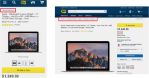
Breadcrumbs for mobile on the left. Breadcrumbs for desktop on the right.
Just remember, even shallow websites can benefit from displaying a morsel of breadcrumb on mobile. This is because other common wayfinding conventions, such as highlighting the current section in the main navigation bar, are often hidden behind a collapsed menu. A single mobile breadcrumb accomplishes a lot while using just a little space.
What the research shows
Usability guru Jakob Nielsen is a big proponent of breadcrumbs. One reason, he says, is the lack of a downside. “Breadcrumbs never cause problems in user testing: people might overlook this small design element, but they never misinterpret breadcrumb trails or have trouble operating them,” Nielsen writes.
While in-depth studies on breadcrumb usage are not exactly a dime-a-dozen, I did find one study that showed breadcrumbs get used as a navigation tool 6% of the time. This is compared with 40% of users who clicked on embedded links, 31% who clicked on the browser back button, and 22% who clicked on the navigation bar. The same study showed that when there is no breadcrumb trail present, the navigation bar and back button get used more often. No surprise there.
What I did find surprising was how significant a role the location of the breadcrumb played in how often it was clicked on. Breadcrumbs placed directly near the page title received a whopping 82% of all breadcrumb clicks, compared with only 18% for those placed at the very top of the page.
Do breadcrumbs improve SEO?
I’ve scoured the internet for an answer to this question, and I’ve also talked with a couple experienced web developers about it. The consensus seems to be that yes, breadcrumbs can improve SEO, but not to put too much stock in this. Search engines like Google and Bing love to change their rules with how they reward or penalize websites in search results.
Here are a couple things we know. Google recommends adding breadcrumbs as one of several ways to “enhance your site’s attributes.” And Schema.org, which is funded in part by Google, has some recommendations on coding with a consistent breadcrumb vocabulary here.
As a side note, it’s interesting to see that Google displays a form of a breadcrumb trail in search results for mobile, but this has no bearing on whether or not the websites themselves include a visible breadcrumb trail. Google seems to be looking at the URL structure, then translating that into a human readable path. Curiously, however, they don’t do this for desktop.
Advanced tips and tricks
As noted above, breadcrumbs can be good for things like:
- Showing where you’re at, so you don’t feel lost
- Showing how a large, deep website is structured (or how products are organized)
- Providing a way to get back a level to explore related content
But breadcrumbs can also go wrong. By their very nature of being another thing on the page, breadcrumbs will fight for attention with other elements. The trick is to make them accessible, but not intrusive. Using a small font size and an expected location — directly next to or above the page title — will keep the breadcrumbs from becoming visual noise.
There’s also the often overlooked matter of a breadcrumb trail’s length. Websites with long-winded page names will tend to have equally long-winded breadcrumbs that wrap onto multiple lines and eat up space. Deep sites with several levels to display can further cause this kind of crumbly page clutter.
In cases like these, something we like to do at the MAC is create alternate versions of the page names: A longer and more descriptive name for the page title, and another shorter name for the breadcrumb. While it’s a good idea for the wording of the currently viewed page to match the breadcrumb 1:1, the other items up the ladder, such as section names or landing pages previously viewed, can be shortened to save space.
Below is an example of how a word-length-optimized breadcrumb trail could look for a higher ed website. Notice how with each click the previously viewed page name gets abbreviated.
- First click: Home > Resources for New Students
- Second click: Home > Resources > Articles on Tuition and Financial Aid
- Third click: Home > Resources > Articles > How to Apply for a Student Loan
The final string of words is easier to read, is less redundant, and eats up less screen space.
Another tip: don’t substitute breadcrumbs for a conventional navigation menu. Because they only show one linear path, standard breadcrumbs are not actually very useful for navigating a website. There is, however, an advanced breadcrumbing technique we used at PainWise.org designed to encourage users to explore when viewing the website on a desktop computer or tablet. Hover your mouse over the last breadcrumb link on this page to see a dropdown list of other pages within that section.
Summary of recommendations
While they shouldn’t be a substitute for other wayfinding conventions, I believe most larger websites would benefit from a location- or attribute-based breadcrumb trail — especially when the main navigation is hidden from view.
Here are my top seven recommendations:
- Use breadcrumbs when designing websites that are three or more levels deep
- Place breadcrumbs directly above or next to the page title
- For mobile, a single breadcrumb (pointing back one level) should be used at a minimum
- Use arrows — not slashes or vertical lines — to imply movement between pages or point back home
- Show the current page, but don’t link to it
- Avoid long and redundant breadcrumbs by using shorter alternatives for section names
- Even with breadcrumbs, a conventional navigation menu should still be used
Final thoughts
In the modern era of UX design, breadcrumbs continue to offer value, including the potential to improve user experience.
It turns out that breadcrumbs, after all these years, are still a fresh idea. Hat tip to Hansel and Gretel for helping millions of website users find their way back home.
This article is also published on Medium.
More Resources
-
Article
How to match your marketing funnel with web content strategyIn the rare case, a visitor comes to your website and immediately signs up for your service or purchases your...
-
Article
If Content Is King, IA Is the CastleEvery effective website needs a foundation. Within it, content strategy and information architecture (IA) are two essential layers. These strategic...
-

eBook
The Smart Start to Developing Your New WebsiteAll website development projects start with questions. Lots of questions. In order to uncover unknowns and proceed with confidence, we...
