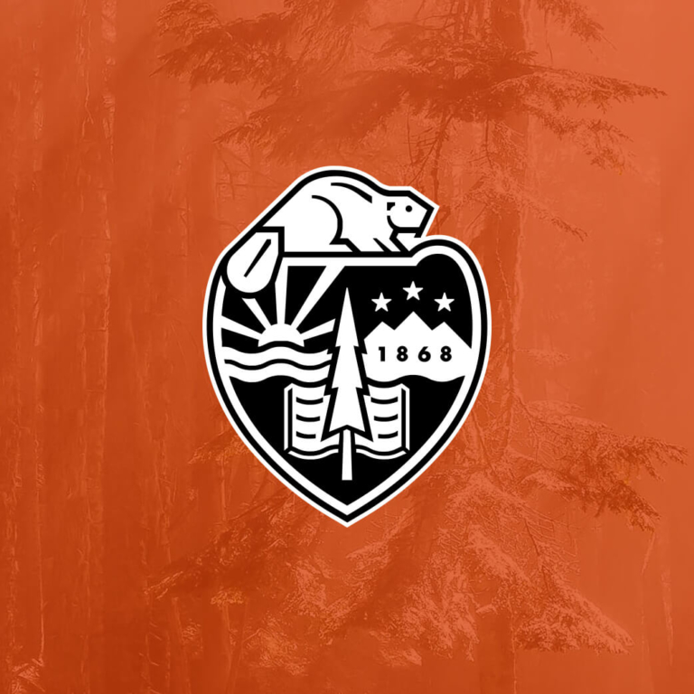
Oregon State University’s media network had a new name — but it didn’t yet have the visual identity to go with it. To bring all aspects of the network’s diverse offerings into sync, the MAC created a cohesive visual identity, unifying the brand across web, TV, radio, and print.
Challenge
Fresh off a name change, Orange Media Network needed a logo and identity system that would work well across a variety of mediums. It also recognized that its multiple sub-brands were visually scattered and disconnected, developed by students and staff over the years. How to tie it all together?
Goal
It was time to take the next step. The network needed a comprehensive brand that would resonate both inside and outside Oregon State University. For that, they turned to the MAC.
Execution
After researching our client’s audiences and goals, we developed an identity system (including logo, tagline, messaging, and stationery) to reach its audiences and reinforce the impact of its new name. To help the network achieve brand consistency, we created a comprehensive identity system that enabled each of the media sub-brands to maintain their individuality, yet be visually tied together in ways that had never before been achieved.
Result
Thanks to a comprehensive rebrand, the students and staff at Orange Media Network are equipped to convey a cohesive identity across all applications: web, TV, radio, and print.
What could a creative, research-based strategy do for you?
The MAC is a strategic branding and web development firm headquartered in the Pacific Northwest. We believe that measurable results begin with deep research: the starting point for inspiration that hits the mark.
Explore Our ServicesRelated work samples


More Resources
-
Article
WCAG 2.2 Guidelines - What's NewLearn about the latest update in the Web Content Accessibility Guidelines (WCAG) to ensure your website is inclusive to all.
-

Article
Creating a Gen Z-Friendly College Experience (and Website)Thanks to the availability of information at their fingertips, Gen Z evaluates colleges against more criteria than any generation before. In this new article we outline 5 factors to consider when creating a college website...
-

Worksheet
How to track success on your website projectSuccess on your project is as simple as M-A-C (Maintain, Analyze, Correct)!