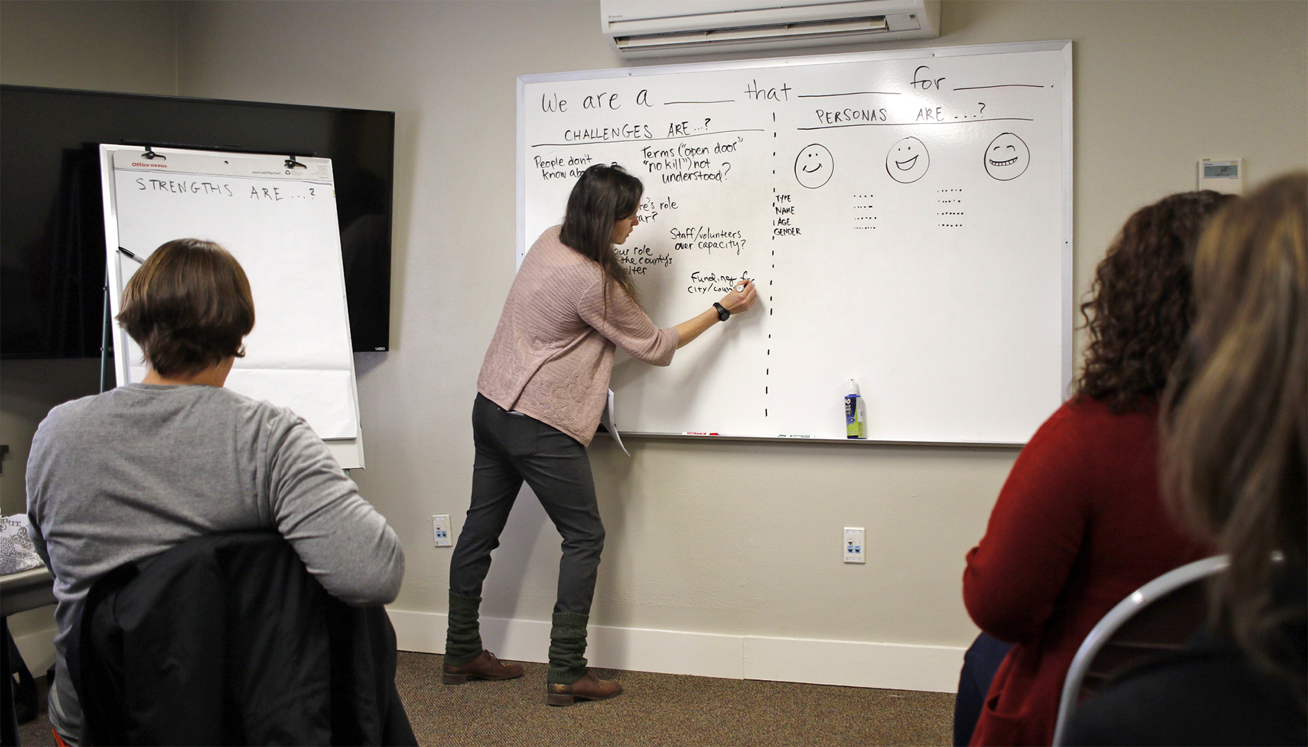
Elisabeth McCumber facilitates a messaging workshop for one of MAC’s nonprofit clients
Designing a website that’s “accessible” means you’re providing an equivalent experience for all users, regardless of the physical or cognitive ability an individual user may or may not have. The World Wide Web Consortium (W3C) puts it this way: “Accessibility means that people with disabilities can perceive, understand, navigate, and interact” with your website without barriers.
Who is the W3C? They’re an international non-governmental association that develops technical specifications for HTML and CSS, as well as recommendations and best practices for security, online payments, and accessibility. The W3C’s international gold standard for website accessibility rules is called the Web Content Accessibility Guidelines (WCAG).
Section 508 of The Rehabilitation Act, first adopted in 1973 and amended by Congress in 1998, requires federal agencies to make their electronic information accessible to people with disabilities. The rules were originally established in the fairly early days of the Internet, but Section 508 was modernized in 2017 to align with WCAG.
What this means in practical terms is, adhering to Section 508 for website development is synonymous with WCAG compliance. And while these standards are merely best-practice “recommendations” according to the W3C, for all U.S. government agencies — as well as for businesses and organizations that receive federal funding — these accessibility standards are requirements under Section 508.
The Americans with Disabilities Act (ADA), which became law in 1990, requires state and local governments, businesses, nonprofit organizations, and labor unions make “reasonable accommodations” for employees with disabilities. ADA is a broad law against disability discrimination that applies to agencies and organizations with 15 or more employees. While it doesn’t go into technical details about website development, Section 508, on the other hand, essentially tells employers how to comply with ADA. How so? By following the WCAG.
In addition to ADA and Section 508, there are other federal laws that touch on the subjects of website development and access to electronic information. The Connected Government Act of 2018, for example, requires all new and redesigned federal agency websites to be accessible using mobile devices.
Washington State’s Policy #188, published by the office of the Chief Information Officer, states that Information Technology (IT) “should be procured, developed, maintained, and utilized so that it is accessible to individuals with disabilities, unless it creates an undue burden on the agency.”
Effective March 2020, all agency websites must comply with WCAG 2.1, level AA. Additionally, all Washington state agencies are required to have an IT accessibility plan that includes:
The Web Content Accessibility Guidelines (WCAG) are separated into three levels of conformance. These roughly translate into “basic stuff” (level A), “essential stuff” (level AA), and “shootin’ for the moon stuff” (level AAA). The W3C acknowledges that AAA may be impossible to achieve, so for the most part we’ve only included rules from the first two levels here. Also, for the sake of brevity — and to prevent eyes from going crossed — we’ve omitted highly technical and fine point recommendations. (If you care to dig deeper into the geeky details, W3C has more than 1,100 technical specs.)
Here’s our quick reference checklist for developing a website that conforms to WCAG and Section 508 standards.
While accessible website design isn’t rocket surgery, it does require an approach to planning that starts at the very beginning. Done right, accessibility is woven into all phases and stages of website development: content strategy and information architecture, user experience and visual design, and programming.
For over 15 years, MAC has been developing websites for public good — including for clients in community health, public services, and higher ed. Need help implementing these accessibility standards for your website? Contact Logan Hoffman at lo***@***********ve.com or call 541.971.4113 ext. 711.
This article is also published on Medium.
Designing a website that’s “accessible” means you’re providing an equivalent experience for all users, regardless of the physical or cognitive ability an individual user may or may not have. The World Wide Web Consortium (W3C) puts it this way: “Accessibility means that people with disabilities can perceive, understand, navigate, and interact” with your website without barriers.
Who is the W3C? They’re an international non-governmental association that develops technical specifications for HTML and CSS, as well as recommendations and best practices for security, online payments, and accessibility. The W3C’s international gold standard for website accessibility rules is called the Web Content Accessibility Guidelines (WCAG).
Section 508 of The Rehabilitation Act, first adopted in 1973 and amended by Congress in 1998, requires federal agencies to make their electronic information accessible to people with disabilities. The rules were originally established in the fairly early days of the Internet, but Section 508 was modernized in 2017 to align with WCAG.
What this means in practical terms is, adhering to Section 508 for website development is synonymous with WCAG compliance. And while these standards are merely best-practice “recommendations” according to the W3C, for all U.S. government agencies — as well as for businesses and organizations that receive federal funding — these accessibility standards are requirements under Section 508.
The Americans with Disabilities Act (ADA), which became law in 1990, requires state and local governments, businesses, nonprofit organizations, and labor unions make “reasonable accommodations” for employees with disabilities. ADA is a broad law against disability discrimination that applies to agencies and organizations with 15 or more employees. While it doesn’t go into technical details about website development, Section 508, on the other hand, essentially tells employers how to comply with ADA. How so? By following the WCAG.
In addition to ADA and Section 508, there are other federal laws that touch on the subjects of website development and access to electronic information. The Connected Government Act of 2018, for example, requires all new and redesigned federal agency websites to be accessible using mobile devices.
Oregon’s Department of Administrative Services has developed a set of guidelines for usability and accessibility for state agency websites. Effective August 2024, all Oregon state agency websites must:
The Web Content Accessibility Guidelines (WCAG) are separated into three levels of conformance. These roughly translate into “basic stuff” (level A), “essential stuff” (level AA), and “shootin’ for the moon stuff” (level AAA). The W3C acknowledges that AAA may be impossible to achieve, so for the most part we’ve only included rules from the first two levels here. Also, for the sake of brevity — and to prevent eyes from going crossed — we’ve omitted highly technical and fine point recommendations. (If you care to dig deeper into the geeky details, W3C has more than 1,100 technical specs.)
Here’s our quick reference checklist for developing a website that conforms to WCAG and Section 508 standards.
While accessible website design isn’t rocket surgery, it does require an approach to planning that starts at the very beginning. Done right, accessibility is woven into all phases and stages of website development: content strategy and information architecture, user experience and visual design, and programming.
For over 15 years, MAC has been developing websites for public good — including for clients in community health, public services, and higher ed. Need help implementing these accessibility standards for your website? Contact Logan Hoffman at lo***@***********ve.com or call 541.971.4113 ext. 711.
This article is also published on Medium.
It’s one thing to deliver an excellent student experience on campus; quite another to build an excellent website. Between us and one of our long-term clients, Colleges of Distinction, we’ve evaluated a countless number of college and university websites — the good, the bad, and everything in between.
In this article we’d like to share some of what we’ve learned, so that you can help your own higher ed website achieve excellence.
Let’s start with some of the most common issues we’ve seen in higher ed websites. Does any of this sound familiar?
No message. Many higher ed websites lack a strong brand story. Also, they’re not sending targeted messages to defined audiences, prompting them to take specific actions.
No differentiation. What makes you different from other colleges and universities? Whether or not you can articulate it internally, we’ve noticed many schools aren’t communicating it clearly online.
Internal focus. It’s easy to get so absorbed in the internal workings of your administration, faculty, and staff that you lose sight of what new students or donors need from your website.
Lots of sub-brands. Do you have a different microsite for each department? The ensuing chaos makes brand consistency a far-off dream — and maintaining the various logos, page templates, and back-end technologies is hard work. More importantly, an inconsistent experience for prospective students, donors, and other users can be jarring and off-putting.
Content clutter. Is your website a recruitment tool? an enrollment driver? a resource for students and faculty? … or is it a repository of all the information you’ve ever used, most of it out of date?
For every challenge, there’s a best practice to resolve it. Let’s look at a few of the most helpful rules we’ve noted from our experience.
Think strategically. A strategy is four things: a problem, a goal, a plan, and a result. Where is your website falling short? Where do you want it to be? Answer that, and you can plan a path to action.
Think like a user. Is the hierarchy of info logical? Are pages organized to meet the user’s most pressing needs first? Have you mapped the paths that users take and built a coherent journey for students?
Make action easy. Every call to action should be clear and convincing, and the conversion points — the places where users take those actions —should be easy to find and respond to.
Cross all those Ts. Every area of your website should be an extension of your brand. The design should be mobile-responsive, accessible from any device. It also needs to be compliant with WCAG accessibility rules.
Establish metrics. Without a way to measure success, who’s to say if your efforts are paying off? We know it can be tricky to identify objective markers — but it can be done, and it’s essential.
When it comes to choosing an agency, there are two options: the conventional route, and the streamlined route.
The conventional route goes like this. You write a lengthy, time-consuming RFP, and post it publicly to invite responses from all corners of the country. The RFP (request for proposal) may or may not provide candidates with the type or quality of information they need to write a meaningful proposal, resulting in hundreds of written pages based on their best guesswork, which your selection committee takes weeks to carefully comb through. After holding a series of interviews, you make a choice, and at last your new creative partner starts work. The process was costly, imprecise, and effort-intensive — and hey, it only took six months to get to the starting line.
The streamlined route works through relationship-building, and as such, it’s much more targeted and timely. You develop a list of parameters you want your partner agency to match (specific areas of expertise, years of experience, etc.), seek referrals, and do some research on your own. You then put out an RFQ (request for quotation), which is shorter and easier to evaluate than RFPs to a limited pool of pre-qualified or pre-selected firms. Once you have narrowed your list of candidates based on the RFQ responses, you pick up the phone or meet in person to discuss what you hope to achieve. The information and insights that emerge from these conversations are more likely to fit your needs and propel you forward. At the end of the day, you’re launching your new website much sooner — and spending less money and energy—than with the traditional RFP process.
Scan for strategy. Many creative professionals make beautiful work — but the point isn’t just to look pretty. It’s to accomplish the goals of your organization and meet the needs of your stakeholders. How do your candidates propose to do so? Do they have a proven process for delivering results?
Invest in discovery. Your agency partner should talk with your internal and external stakeholders, perform a brand audit and competitive analysis, and research your history, values, goals, and competitors. Up-front research is the necessary foundation for getting started and will guide decision-making throughout the project.
Avoid death by committee. When collecting initial input, ask everyone. Make sure key stakeholders and representatives from every target audience have an opportunity to be heard. But when making decisions, establish a small, tight-knit team with the judgement to weigh conflicting perspectives and make the call.
Be bold. Today’s degree-seekers aren’t looking for the same old / same old. Don’t be afraid to look and sound different. We know standing out can be scary — but when you do, great things can happen.
The tips above may seem simple, but make no mistake: they’re game changers. After researching and auditing countless higher ed websites, we’ve seen these principles bear out over long and close observation. We hope they help you achieve excellence in your website, too.
This article is also published on Medium.
All website development projects start with questions. Lots of questions. In order to uncover unknowns and proceed with confidence, we recommend starting with a Discovery phase. Learn all about how MAC does Discovery in this free, 8-page illustrated guide.
This handy infographic will take you step-by-step through MAC’s branding process.
Here at Madison Ave. Collective, we used to do brand messaging the slow way.
First, we would schedule interviews. Lots of interviews. We would talk to chief officers about the heart and soul of their company. We would talk to a long list of other stakeholders, too, to understand their particular viewpoints. After generating a ton of qualitative data, we would dig through for insights and patterns in order to put a finger on the organization’s true story: its authentic culture and identity. We would share our findings with our client and further refine our conclusions; then, finally, we would use what we discovered to craft some powerful brand messaging.
The process worked. It’s just, there were a couple problems.
One is simply the amount of time it took to do it. The other is a basic truth in our industry, which will be familiar to any creative professional reading this: any time you unveil work to a client without having involved them closely on the journey, you’re going to meet with resistance. It doesn’t matter how great the work is; there’s simply a human impulse to resist the unfamiliar, especially when it feels personal, as branding often does.
Now, at MAC, we believe in good process. In fact, that’s often a reason our clients choose us: we bring discovery to a whole new level, and we certainly never want to dilute that. However, we also strive to raise our game, and in this case, that meant asking ourselves two questions:
These questions led us to make some deep changes in our discovery process. And the result?
Well, the result is our brand messaging workshop. We ask our client to gather a group of participants for an entire morning or afternoon, including all vital perspectives and a variety of viewpoints. Then, over four hours, we work together to unearth some major insight—getting the energy flowing, trying out ideas, seeking desensus (productive disagreement), and setting the stage for the deliverables to come.
How do we do it?
Like so.
Our standard messaging workshop is divided into three blocks of time. The purpose of the first session is to generate consensus around the branding effort itself. Why are we here? How will we know when we’ve succeeded? What are the organization’s real challenges, strengths, goals, and audiences?
To that end:
By the end of this block, participants have a common understanding of the purpose of the messaging that we’re aiming to develop. They know, too, whom we’re aiming to reach and what those specific audiences need to hear.
Elisabeth McCumber facilitates a messaging workshop for one of MAC’s nonprofit clients
The purpose of our second block of time is to develop the concepts that will feed into the creation of a positioning statement (“we are a [what] that [does what] for [whom]”) — which is an essential component for any brand toolkit, locating the company in its market and identifying its unique selling proposition.
Here’s how the session goes:
Again, no final decisions are made, but by the end of this block, the entire group respects the effort it takes to develop brand messaging; participants also share a common knowledge of why certain choices may work better or worse for their organization. Perhaps most importantly, they feel a personal investment in the outcome: their voices have been heard, and this statement now belongs to them.
The purpose of our third and final block is to train participants on their elevator pitch, so they have some language in their back pocket to talk to people about the company — and the comfort level to do so. There’s often a bit of stagefright to overcome here, so we start this session with a warm-up.
Our half-day messaging workshop is an intense experience — but oh, so productive. In fact, we’ve received overwhelming appreciation from every client we’ve facilitated this experience with to date.
At the end of the day, participants feel heard, inspired, and aware of their organization in a more nuanced and meaningful way. Meanwhile, our team goes home with notes, photos of our whiteboard brainstorms, and concepts from many different perspectives, so we can begin the task of turning what we learned into an incisive messaging toolkit for our client’s new brand.
To be clear, this process does not remove the work it takes to develop strong, creative messaging. What it does, rather, is dramatically reduce the hours leading up to that work — while significantly improving the quality of information we’re able to draw from.
Most of all, it brings everyone together on the final product. When workshop participants later see our deliverables, they also see their own insights shining through. They understand the work it took to get there, and they share a common story for why we’ve chosen one direction over another. Ultimately, client buy-in (to say nothing of satisfaction) is easier to achieve, and that’s a win for everyone.
After all, a brand isn’t built to sit on the shelf.
It’s meant to get out there in the real world, where real people are. It’s an identity that every member of an organization should feel genuinely proud to live on the daily — and when you find your way there together, that identity is only more authentic.
This article is also published on Medium.
Picture this: You and your staff have spent the past several months collaborating with a branding design firm to revamp your organization’s logo, messaging, and communication tools, and the date you’ve set for proudly revealing it to the world is fast approaching.
A lot’s at stake. You’ve invested a great deal of time and money in your rebranding effort, and you hope to introduce it in a way that gets your audiences as excited about the new identity as you are. You want your internal team to start using the new logo, messaging, and brand tools in the correct way, right away. What you don’t want is an uncoordinated transition with a lukewarm response — or worse, a mix of chaos, confusion, and pushback.
The process for developing a winning brand rollout plan will be collaborative — shared between you, your internal staff, and your design team — and should include all the details about who, what, and when. It begins with making a list (or several different lists, based on who needs to know what), writing down your plan, and clarifying all the tasks and expectations so everyone’s ready to roll when the big day comes.
What details should your plan include? Here are six steps to a successful brand rollout strategy.
What’s your vision for introducing the new logo and branding elements? Are you hoping for big and splashy — or does it make more sense to release the brand to target groups over a period of time, in stages? The size and visibility of your organization, and reasons behind why you rebranded in the first place, could help you decide the best approach.
Updating business cards and stationery is one thing; replacing signage on buildings and graphics for a fleet of vehicles is another. The budget you set for rolling out the new branding will be influenced in part by your objectives (see above), but also by practical matters such as these. Is spending thousands of dollars to develop a fancy reveal video a good use of funds? For some organizations, it could be. For others, that money might be better spent on printing new sales collateral, for example.
What resources (employees, vendor relationships, venues, tools) are available to help you with the rollout? Depending on your budget and staffing abilities, you may need to rely on your branding design firm to ensure your long list of rollout tasks do indeed get done.
Introducing your brand won’t be a one-time event. Even if you decide to make a big splash with a high-energy public introduction, there will no doubt be many internal and external stakeholders whose buy-in you’ll want to get from behind the scenes, first.
Attention will need to be given not only to who you must communicate with about the new branding, but also in which order. For example, you might choose to start with key company staff, then board members, then major customers or donors, and lastly the media and general public. Depending on the size of your organization, there could be managers in certain departments who will need to know as early as possible how the new branding could impact their team and projects. Overlooking someone important, or sharing the branding with a certain group too soon, could throw a wrench in your rollout.
Whether it’s a presentation to stakeholders, a video on Instagram, or a press release distributed to local news media, introducing your new brand is an excellent opportunity to shape and share your organization’s larger story. You’ve invested a significant amount of energy and diverted resources away from other projects to develop the new branding — not to mention the costs associated with hiring an experienced design firm. Why did you do it? Does the timing for your new branding coincide with other changes in your organization? Now is the perfect time to remind all involved why the effort was (and will be) worth it.
This step involves both outward- and inward-facing considerations: preparing for public response, and also equipping your team with the tools they need to implement the new branding effectively.
To begin, think about how your target audiences are likely to react when they see the new branding. While some will cheer, others will question. If yours is a nonprofit or government organization, the public could become cynical about the amount of money (perceived or actual) that you’ve invested in the rebranding effort. Without a point of reference for the time and money that a major rebranding effort entails, it’s easy to understand why some members of the public will be less than thrilled. One way to temper negative feedback is simply to avoid asking for public input in the first place. (I’ve written more about how to manage outsiders’ input here.) I also recommend telling your audiences about the processes—including a thorough research phase—that guided you to land where you did.
In the meantime, you’ll want to empower staff and other stakeholders with easy-to-access logo files, comprehensive brand guidelines, and flexible templates. Then, anticipate what additional needs and questions will arise about how to use the new branding. Would an all-staff training or recorded video webinar reduce the amount of redundant questions you’re bound to be asked in the coming weeks?
We recently completed an extensive rebranding project for Linn-Benton Community College (LBCC) that included assisting with the rollout. An important aspect of the plan was timing: it was decided that their public branding reveal would coincide with an annual September gathering of more than 300 faculty and staff, held a week before students arrive on campus. A good portion of the 90-minute meeting was dedicated to introducing the new logo and brand messaging, and sharing the college president’s vision for the future. At the end, everyone walked away with an LBCC logo T-shirt and other freshly-minted swag. More importantly, they left with a good feeling about the direction the college is heading.
In this case, the choice of when (piggybacking on an existing event) gave our client the opportunity to share the why behind the what with a captive audience of key stakeholders. Good things are happening at LBCC, and the new brand identity is part of it.
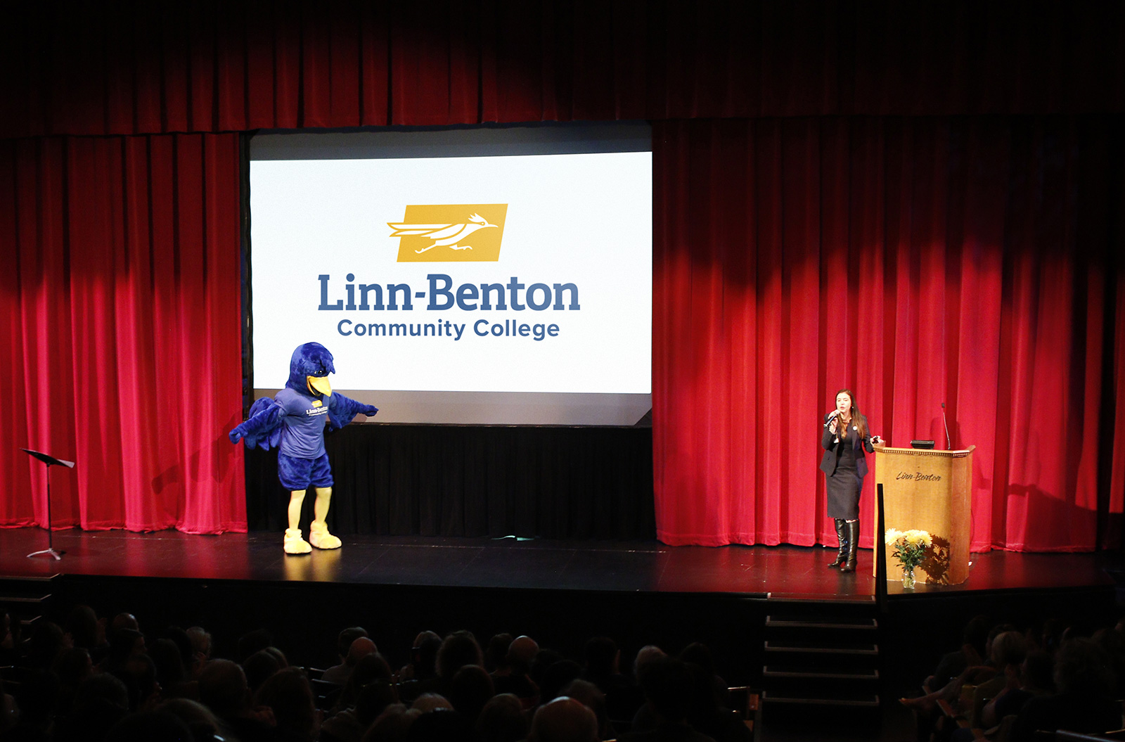
Rocky the Roadrunner was on stage to help unveil LBCC’s new branding
For many people in attendance that morning, the reveal had been eagerly expected. Several months prior — and long before we began sketching our first logo concepts — hundreds of LBCC staff, faculty, students, and alumni participated in an online survey we developed to better understand the strengths and weaknesses of their existing (now previous) branding. The survey was just one part of an in-depth Discovery phase that also included one-on-one interviews with key leaders, focus groups with staff and students, and multiple rounds of review with a 20-member rebrand task force comprising a diverse body of the college’s stakeholders.
In other words, buy-in for LBCC’s new branding didn’t only happen at the big September event. It occurred with selected individuals over a period of weeks and months, all while building energy and buzz in anticipation of seeing the fresh new look on campus. So in a way, preparation for rollout took place long before designing the new identity system had even begun.
» See more about our branding work for LBCC
Introducing your new brand identity will be an all-hands-on-deck effort, and the importance of proper planning can’t be overstated. When done well, you’ll know who’s doing what and when, you’ll get early buy-in from the right people in the right order, and you’ll take advantage of this fantastic opportunity to share the organization’s story with your target audiences.
Whether you choose to keep it low key or make a lot of noise, rolling out a rebrand is never a one-time event. A winning strategy will not only guide you in the months and weeks leading up to the public reveal, it will also help you anticipate what happens in the days that follow it. Ultimately, a well-executed rollout plan will strengthen your organization’s brand image— its reputation, awareness, and place in the market—for years to come.
This article is also published on Medium.
So, you’re about to embark on a rebranding project for your organization. Congrats! If done well, and you follow a trusted map, you and your crew will be proud of where you land. If done poorly, the waters ahead could turn treacherous.
Let’s start with what not to do.
Some marketing consultants may tell you the best way to engage a target audience in the branding process is to invite everyone to vote or comment on three final logo concepts. Let the people choose! More input the better! If everyone has a say, who can complain? This advice may sound good at first, but in the real world it’s a big gamble with few upsides. Asking outsiders who have no skin in the game and who have little-to-no knowledge of your organization’s plans and goals to choose your brand identity has roughly a 97% chance of not going well. The conflicting feedback and sour comments you’ll receive (I can’t believe they budgeted $100K on this! … A fourth grader with a smartphone could design a better logo!*) will cause stress, self-doubt, and may sink the ship entirely. Just don’t do it.
Similarly, don’t hand three logos to your spouse or kids or neighbors and ask them to pick their favorite. Like belly buttons, everyone’s got an opinion. But if they aren’t your target customer, their personal preferences are no more relevant than if coming from a random person on the street. Don’t ask your friends and family.
Here’s an analogy I like to use: Inviting the public to comment on logo options is like a pregnant woman asking 2,000 Facebook friends to help her name the baby. She’ll regret having ever asked the question when irrelevant and conflicting opinions flood in from people who aren’t the least bit invested in the outcome. Instead, a much better approach is when mom and dad take time to thoughtfully decide what to name their baby, then announce their decision to friends and family after Henry is born. At that point, extended relatives from Appalachia will have no choice but to love the little guy’s name. (And even if not at first, they’ll warm to it over time. Familiarity is a powerful force. It’s why change is so hard for some people.)
* Inspired by actual public comments on Santa Fe County’s proposed logo concepts. Needless to say, after an extensive (and expensive) redesign process they ended up keeping their old logo.
Stakeholder interviews, online surveys, and focus groups can all be good ways to gather information, test assumptions, and refine ideas as you and your design team build towards selecting a final logo. The trick is who, how, and when.
Rather than waiting until the end, engaging internal and external audiences early in your logo development process has plenty of upsides. For one, the information you gather upfront will empower your designers to develop smarter solutions. Proper research will eliminate guesswork and inspire creativity.
Additionally, the people who care most about your organization’s success will be glad you asked before final logo options are presented. Knowing that you took time to listen to others will give them a greater appreciation for the final outcome — even if it’s different from what they would have personally chosen.
Moreover, when publicly unveiling your new branding (click to read article) you won’t be nervous about how folks will respond because the story you tell — your presentation, press release, social media posts, etc. — will reinforce the research-driven process that led to your final logo and identity system.
Before any logo sketching begins, your rebranding schedule should include time for one-on-one conversations with individuals who have deep experience or knowledge about your organization or industry. This could be the company president, your top three customers, outside partners, or anyone else your design team can learn from. If your organization is a nonprofit you may want to interview active volunteers and major donors to find out why they choose to invest in your organization.
Here at the MAC we include stakeholder interviews with every new branding project. No exceptions. This critical first step allows us to learn about our client’s unique challenges and strengths, and often helps them discover new things about their organization as well.
At the end of our research and discovery phase we’ll hand our client a written findings and recommendations document that summarizes what we’ve learned through the stakeholder interviews — as well as from the online surveys, branding and marketing audit, competitive analysis, and other deliverables we agreed upfront to provide. All of this is completed before we begin designing the first logo.
Developing an online survey can be a great way to learn how a large number of people think and feel about your organization’s brand and visual identity. The key is to ask questions about your current branding.
For our client Linn-Benton Community College (see case study) we developed two separate surveys: one to gather input on their current (now previous) branding, and another for input on their current website. More than 800 people participated in the branding survey alone, which was fabulous, but also a ton of data for us to sift through.
Quantitative questions, like those with radio buttons or multiple choice, are easy to tabulate. For qualitative, open-ended questions you’ll want to look for patterns and recurring themes in the written responses. Both types of questions are valuable and should be included.
If you decide to create an online survey we recommend giving participants the option to keep their answers anonymous. This will result in more candid, honest feedback. That said, at the end of the survey you can also invite them to enter their name and contact info to be considered for additional discussions (e.g. focus groups) about the new branding.
As far as which tools to use, Survey Monkey and Google Forms are both good options in our experience. Google is our first choice as it enables us to easily collaborate with clients on writing the questions and analyzing results. Plus, the price is right.
While online surveys can be great for gathering broad input from a large community in a short amount of time, you may need to go deeper with one or more specific audience segments. This is when focus groups can be useful.
For LBCC we facilitated separate focus groups for faculty/staff and students. By that point in the process we had already completed the research and discovery phase and were ready for input on several initial logo concepts. The feedback received was invaluable. After the focus groups were finished we decided to eliminate one of the weaker logos in order to focus energy on refining the other stronger ideas.
If you choose to include focus groups in your process, do them while there is still time in the schedule to make changes—don’t wait until the very end. Also, remind everyone that the point is not to form consensus around a favorite logo. In other words, don’t spread out five options on the table and ask participants to decide which one is the best. Tasking a focus group with choosing a logo is like asking ten strangers to choose a flavor of ice cream. One of two things will happen. Either everyone will agree on the safe vanilla option, or those with the loudest voices will persuade others and get their way.
A better focus group method is to invite each person to comment on each logo, one at a time. You can lead participants with an open-ended question such as, “What comes to mind when you see this concept?” After everyone has had a chance to speak individually you can invite further discussion from the group. Then, repeat the process for the next logo. But be clear at the beginning that you’re not asking them to agree on their favorite. Tell them you value their input and you’ll use their feedback to improve the concepts.
Navigating the shark-infested waters of public input doesn’t have to be dangerous. With an experienced design firm at the wheel, and a healthy supply of strategic research, you’ll sleep better at night knowing you trusted the process to make the best, most informed decisions for your organization’s new branding.
This article is also published on Medium.
Here at Madison Ave. Collective, we have a tested naming process for creating a memorable name that engages your most critical audiences and positions you for success.