For more than 133 years, the towering Benton County courthouse has been a hard-to-miss symbol of local government. And for as long as anyone could remember, the County’s logo had centered exclusively around this historic building. Problem was, the old-fashioned image didn’t exactly capture this progressive community’s vision for the future.
Benton County wanted to build a brand that was more modern, more vibrant, more inclusive. And for that, they called on the MAC.
Challenge
Benton County is primarily a rural area blanketed with forests and farmland, framed by the Oregon Coast Range on one side and the Willamette River on the other. The county seat is Corvallis, a progressive college town that is home to Oregon State University.
Located on a busy road running through downtown Corvallis is the state’s oldest operating county courthouse, built in 1888. And while the grand building is one of the region’s most visible and iconic landmarks, our research told us that an image of the historic courthouse alone didn’t accurately capture the identity or vision of the County. The people we interviewed typically had either positive or neutral feelings about keeping the building as part of the logo. However, there were others who said the courthouse evoked a negative and unwanted message about crime and punishment.
With no consensus as to whether the courthouse should even remain part of Benton County’s brand identity, our larger challenge became one of representing the diverse and sometimes competing interests of the community. Additionally, would it be possible to incorporate the County’s central principles of equity and health?
Deliverables
-
Strategy
-
Branding
-
Marketing Tools
Goals
One of the primary goals of the project was to better align Benton County’s visual identity with its recently updated core values. This meant it should be more forward-looking, more inviting for diverse people groups and perspectives, and more representative of the natural environment. This in turn likely meant that if the courthouse was to be included in the branding, its presence needed to be minimized.
Additionally, the new brand identity system had to be easy for more than a dozen different departments to adopt. A cohesive family of logos was needed, as was a document to guide County employees in applying the branding to publications, social media, and more.
Finally, because the County’s previous logo contained many small details it was often difficult to use. Our client needed a logo system that was flexible — one that could be effective in both full-color and single-color applications (black-and-white voters’ pamphlets, for example), as well as be easily applied to either light- or dark-colored backgrounds without compromising legibility or requiring design workarounds. We also wanted to improve the legibility of the logotype at small sizes or when viewed from a distance.
Our Discovery research confirmed that Benton County’s new branding needed to be more forward-looking, more inviting for diverse people groups and perspectives, and more representative of the natural environment.
Process
Our process began with an in-depth research and Discovery phase. This included an audit of the County’s current branding as well as a close look at the branding for 35 other counties around the state. We interviewed community members to learn what aspects of the County were important to capture in the new visual identity.
Following Discovery, our design team developed mood boards and began sketching a wide range of logo concepts. On one end of the spectrum were courthouse-focused logos, and on the other end were logos without any reference to the historic building. Several logos were presented to the Benton County Board of Commissioners and rebranding committee for initial input. We then tested four of the strongest concepts with focus groups representing a diverse population. Based on all input gathered, the logos were refined and presented back to the commissioners for a final selection.
We then developed a comprehensive brand book which identifies the color palette, supporting fonts, guidelines for using the logo and various department sub-brands, and other tools for County employees.
Before and after: Benton County’s previous historic-looking logo compared with their new, more vibrant logo that pays tribute to the natural environment.
Results
The final logo mark utilizes hand-drawn shapes and earthy tones, evoking feelings that are warm and welcoming. Represented within the rectangular, window-shaped icon are three major local landmarks: Mary’s Peak, the County Courthouse, and the Willamette River. And the customized logotype comprises qualities which are both traditional and modern.
All together, the elements of the logo — color, shape, typography, and symbology — communicate a healthy, livable community with a commitment to preserving the natural environment.
The new brand identity is easy to use in full-color as well as one-color (black-and-white) applications. The wider color palette is vibrant and diverse, and the system includes several variations of the County logo suitable for both horizontal and vertical applications, as well as options for light- and dark-colored backgrounds. Additionally, we created artwork for more than a dozen department sub-brands and a version of the logo suitable for use with other partner organizations.
Want to see more? View the Benton County brand book.
![]()
Benton County’s new branding is a 2020 American Graphic Design Awards recipient, recognized for being among the top 10% of entries nationally.
Above: Publication designed to promote Benton County’s 2040 Thriving Communities Initiative
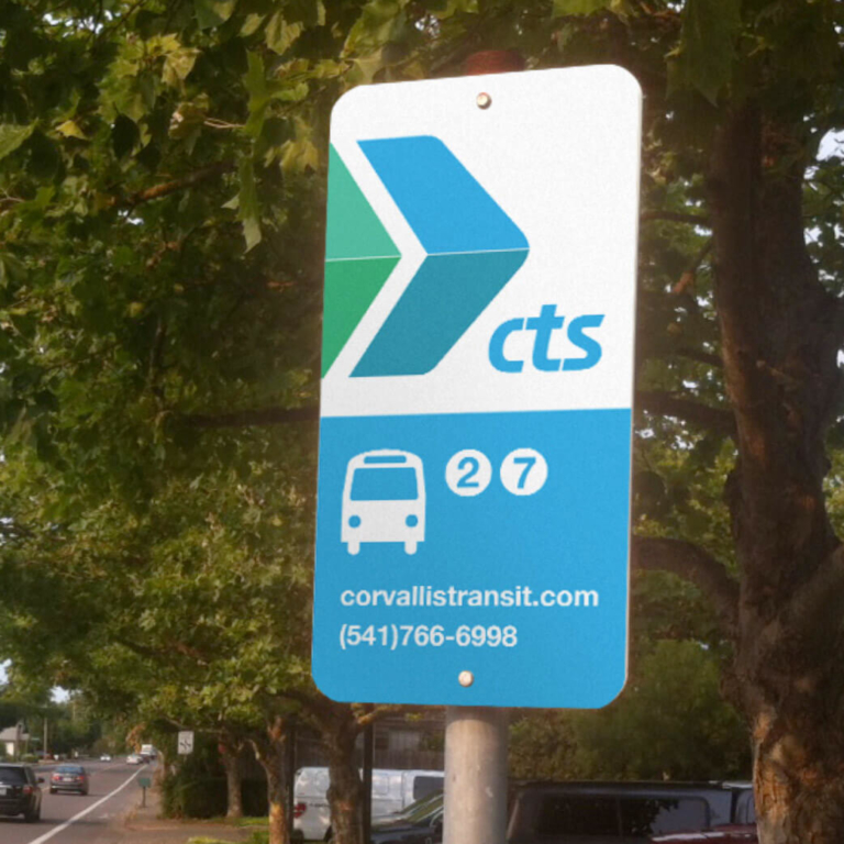
Benton County’s logo system mockups and examples: Black-and-white, full-color, and department sub-brands
Our priority was to build a brand that reflects the community it represents. That’s why we engaged key community members and organizations from across the county to ensure that our new look was welcoming, inclusive and dynamic.
Benton County’s previous visual identity was old-fashioned and difficult to use. More importantly, it didn’t represent the County’s core values. Our research and design process led to a forward-looking and welcoming brand identity designed to serve the community for years to come.
What goals do you have for your community’s brand?
Explore Our ServicesRelated work samples


More Resources
-
Article
WCAG 2.2 Guidelines - What's NewLearn about the latest update in the Web Content Accessibility Guidelines (WCAG) to ensure your website is inclusive to all.
-

Article
Creating a Gen Z-Friendly College Experience (and Website)Thanks to the availability of information at their fingertips, Gen Z evaluates colleges against more criteria than any generation before. In this new article we outline 5 factors to consider when creating a college website...
-

Worksheet
How to track success on your website projectSuccess on your project is as simple as M-A-C (Maintain, Analyze, Correct)!