Heartland Humane was doing good work in Benton County. Unfortunately, public misconceptions about their services — coupled with an uninviting look-and-feel and inconsistent marketing — had their brand identity in the doghouse. What would it take for this nonprofit to reshape their image into the cat’s meow?
Challenge
When Heartland Humane Society first came to us, they knew they had some problems with their public image and communications. Some members of the local community thought they were a kill shelter (they’re not), while others simply weren’t aware of the many services and educational programs available to children, families, and of course pets. Lastly, there was confusion within the community about how the organization gets funded, which types of animals they take in, and how they’re different from other shelters in nearby cities.
As far as their logo and branding, they needed an identity system with guidelines and tools for staff and volunteers to use in marketing Heartland that would feel more warm and inviting, look more professional, and be presented with more consistency.
They also needed messaging to better communicate with their core target audiences: adopters, volunteers, and financial donors. In other words, they needed help getting to the heart of why Heartland matters.
Deliverables
-
Strategy
-
Messaging
-
Branding
Goals
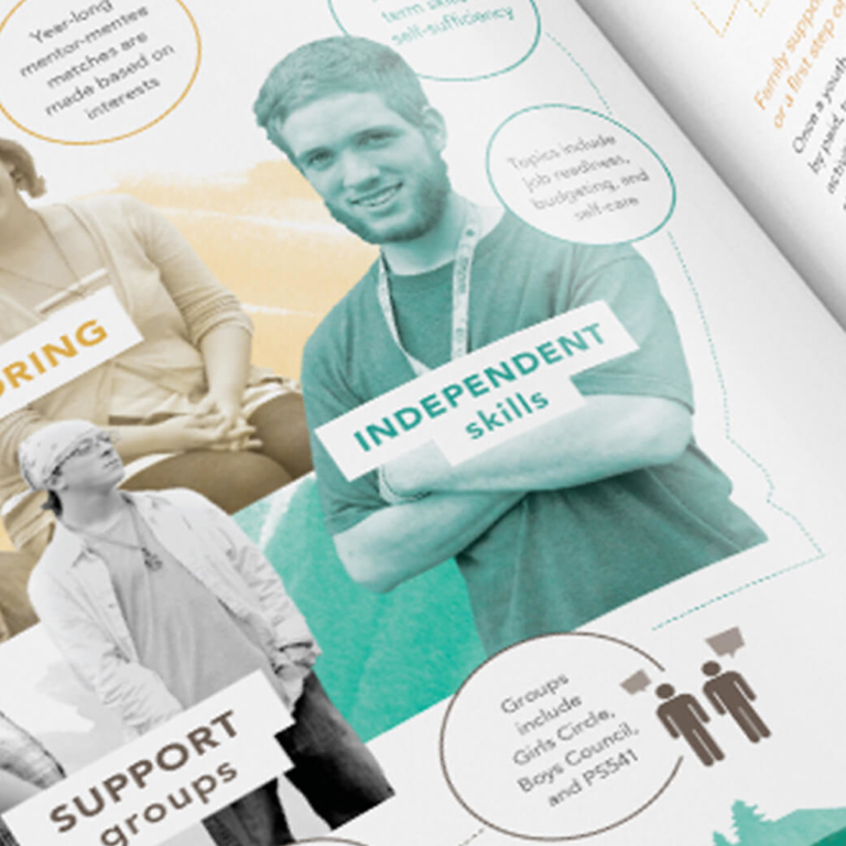
For prospective financial donors, our goal was to help them understand the huge service Heartland provides the community, especially its impact for children; to know that Heartland offers many different services including veterinary care; and to see why their donations matter among Heartland’s other funding sources.
For new volunteers, we wanted them to know the many ways to get involved with Heartland, and that families with children could serve together.
And for potential adopters, we wanted them to know that Heartland is a loving, fun place that puts the pet’s best interest first, where pets of all kinds receive care and socialization, and where pets are carefully matched with people.
Heartland is not just about pets. It’s also about the people who care about pets. Their new brand identity needed to capture this compassion.
Before and after: Heartland’s previous logo compared with their new colorful, more approachable logo and tagline
Result
MAC redesigned the logo using softer, more rounded shapes and a brighter, more friendly color palette. And while keeping the emphasis on cats and dogs — the two most common types of animals Heartland takes in — we introduced a human hand to emphasize the connection Heartland facilitates between people and pets.
We also provided Heartland with a suite of messaging tools including a positioning statement and elevator pitches to use when speaking with various target audiences. And their new tagline, Shelter & Care, puts compassion for pets at the center of the brand identity.
Finally, we delivered a comprehensive brand book including a toolkit of animal shapes to convey the fact that Heartland cares not only for dogs and cats, but also for chickens, turtles, rabbits, and any other pet that comes to their door.
Heartland Humane is a nonprofit animal shelter and care organization working to make Benton County a safe and healthy place for every pet, and for the people who love them.
Heartland Humane needed a warmer, more inviting brand image to better communicate their love for pets. MAC guided their team through initial strategy, then developed a visual identity and messaging system to enable the nonprofit to have an even greater impact on the community they serve.
How could a new brand identity enable your organization to be more effective?
Explore Our ServicesRelated work samples


More Resources
-
Article
WCAG 2.2 Guidelines - What's NewLearn about the latest update in the Web Content Accessibility Guidelines (WCAG) to ensure your website is inclusive to all.
-

Article
Creating a Gen Z-Friendly College Experience (and Website)Thanks to the availability of information at their fingertips, Gen Z evaluates colleges against more criteria than any generation before. In this new article we outline 5 factors to consider when creating a college website...
-

Worksheet
How to track success on your website projectSuccess on your project is as simple as M-A-C (Maintain, Analyze, Correct)!