Portland Children’s Levy needed a brand refresh to nurture voter and community engagement — so that it can keep helping local children learn, grow, and thrive. Seeking an experienced creative partner, they asked the MAC to guide them through this important next step.
Abstract
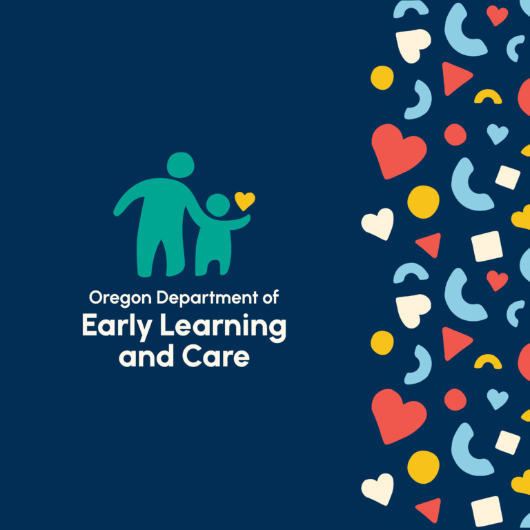
In 2002, voters created Portland Children’s Levy (PCL), which uses property taxes to support programs for child abuse prevention, childhood hunger, early childhood development, foster care, after-school programs, mentoring, and more. Its team believes that all children deserve educational and economic opportunities to thrive and prosper.
Sixteen years later, under new leadership, PCL approached the MAC for a brand refresh: one that’s modern, mature, and memorable. Through a thoughtful, iterative process, we designed an identity to help Portland voters and community partners see themselves reflected in the Levy’s work.
The result? A vibrant brand designed to nurture community engagement for years to come.
Deliverables
-
Branding
-
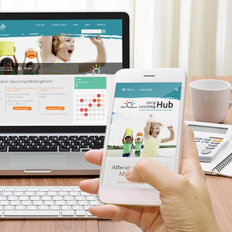
Website
-
Marketing Tools
Challenge
Portland Children’s Levy is a public initiative that invests $19 million a year in children’s programs in Oregon’s largest metro region. For every dollar raised from property taxes, 95 cents go directly to early childhood development, school engagement and activities, high school graduation, and family safety and stability.
For the initiative to keep making a difference, it needs voters to stay engaged. So, after the levy was renewed in 2018, its leadership asked the MAC to create a fresh new look to foster robust future engagement.
Goal
Our client needed a logo that expresses a mature, established organization. But while “mature” is good, “stuffy” is not. We didn’t want their new logo to feel old or institutional.
More importantly, the refreshed brand needed to convey diversity and inclusion: two pillars that uphold everything the organization aims to do.
The goal behind the Portland Children’s Levy is to help all children reach their full potential. It does so by focusing on where needs are greatest.
Execution
Working in dialogue with our client, we created a vibrant color palette to express the joyful energy of a healthy childhood.
Then, using geometric shapes, we developed a clean, professional logo that ties PCL’s signature letter P to the concepts of play and learning — paired with a wordmark whose friendly typeface makes the whole effect welcoming and approachable.
Before and after: A new, vibrant look for the Levy’s brand
Finally, we extended this look-and-feel into a toolkit of colorful shapes that supports multiple applications, and delivered an identity guide to help the Levy apply the brand elements (fonts, colors, etc.) to stationery and other collateral.
The organization’s website was updated to match the new visual identity.
Result
The Levy’s new identity is lively, memorable, compassionate, and clean. With vibrant colors, geometric blocks, and a friendly feel, it supports the idea that every child should have a bright future.
We love our new branding. The Levy supports 40+ service providers, so the identity guide has been invaluable for partners to grab whatever they need to collaborate on social, print and web.
Portland Children’s Levy came to us with a brand that needed to mature, and a message of diversity and inclusion. We delivered a visual identity that brings that message home — while also bringing the Levy into the next phase of its future.
Where could a new, engaging brand bring you?
Explore Our ServicesRelated work samples


More Resources
-

Article
The Challenge of Measuring Website Accessibility NeedsHow many people with disabilities use your website? The truth is, we can’t reliably answer that question, and the reasons why reveal the complexities of accessibility and inclusivity online.
-
Article
Safeguard Your Investment: the 411 on Accessible DesignHow can an organization truly serve the public if they can’t reach the whole public? Accessibility on the internet shouldn’t be an afterthought for your organization, but a fundamental consideration.
-
Article
How to Win Over Riders with a Better Digital Transit ExperiencePublic transportation keeps our cities moving, connecting people to their jobs, schools, and favorite hangout spots. As tech keeps advancing, transit agencies are turning to digital tools to step up their game.