Shadowserver provides Internet security services of dizzying scope and profound impact — yet given its quiet approach, uncommon business model, and confusing visual identity, it faced a major perception problem. To strategize the way forward, they hired the MAC.
Abstract
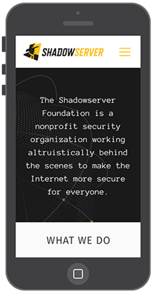
The Shadowserver Foundation is a nonprofit Internet security organization with global reach and profound impact. But with a confusing, outdated brand identity and persistent public misperception, the organization was struggling to connect with the audiences it needed to reach.
Shadowserver hired the MAC to develop a modern brand and website to support its effort to procure new funding and build new partnerships with C-level decision-makers working in government, law enforcement, industry, finance, and academia.
After a phase of extensive research and strategy development, we translated our client’s complex service offerings and uncommon model into messaging designed to resonate with its audiences.
We then created a visual identity to preserve our client’s significant brand equity, while firmly redefining it as a powerful force for good: resolving a crucial misperception to the contrary.
Finally, we developed a clean, intuitive website that presents our client’s extremely technical service offerings in a way that’s easy for its audiences to understand at a glance.
Deliverables
-
Messaging
-
Branding
-
Website
Strategy
Challenge
Shadowserver is powered by some of the world’s most seasoned data experts, researchers, and engineers. The scope and impact of its work, to put it lightly, is vast.
Among security professionals, the organization is well known and deeply trusted. Outside those circles however, it’s largely invisible — intentionally so. This quietness, combined with a dated, misunderstood brand and lack of messaging, added up to a major perception problem.
- The organization’s website was simply a wiki: a repository of facts and statistics, some of it outdated, with no clear message.
- Its logo depicted a menacing man in a black hat. In cyber security, “black hat” is a shorthand for bad guys; the logo represented precisely the opposite of everything that our client stands for.
- Public perception of Shadowserver was not accurate. Media were describing it as an all-volunteer organization, citing facts over a decade out of date. Also, whenever Internet users from the general public would notice that Shadowserver had scanned their IP address, they were prone to panic, thinking they were being attacked by cyber criminals.
It was time for our client to take control of its narrative.
The original logo depicted a menacing man in a black hat. The new logo shows our heroic figure facing toward the light.
Goal
Shadowserver needed a brand identity to help it procure new funding and build partnerships with its target audiences.
To that end, it had to translate its extremely complex service offerings — as well as its unusual, altruistic model — into messaging that decision-makers around the globe would understand.
It also needed to redefine its public image, presenting itself as a trustworthy, white-hat security team of highly capable industry experts.
Discovery
To communicate our client’s complex offerings and altruistic business model to multiple target audiences, we knew we’d have to do our research right.
We started with a brand audit to define our client’s identity challenges. We performed a competitive analysis to chart a strategy through the specific landscape they navigate. We conducted multiple interviews with specialists from across the Shadowserver team; then we engaged in extensive, ongoing dialogue to confirm our findings, fill in the gaps, and fine-tune our understanding.
Execution
We discovered that while Shadowserver was communicating well with technical folks, it wasn’t resonating with the senior decision-makers it needed to reach. The brand needed a strategic refresh to connect with a corporate, C-level audience. But its old logo carried significant brand equity. That shadowy man enjoys an enthusiastic following in the cyber security community — he had to stay. But he needed to look like a good guy.
Drawing from our research, we translated our client’s culture and mission of quiet, behind-the-scenes altruism into an original tagline, “Lighting the way to a more secure Internet.”
Then, playing on the metaphor of light and leadership, we used color and angle to evoke a beam of light, while giving the logo a forward lean — preserving the man’s film noir personality, but bringing him out of the shadows and transforming him into a force for good.
To extend the professionalism of the new branding through every future application, we provided our client with a comprehensive brand book: equipping Shadowserver to present their organization to crucial external stakeholders with consistency and credibility.
Given the complexity of our client’s work, it would take some real finesse to say all this in simple, straightforward language, without compromising technical accuracy. Then again, that’s just the type of challenge we love.
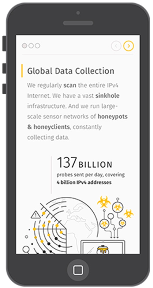
Shadowserver works with leaders in national governments, law enforcement teams, CSIRTs, financial and academic institutions, and major businesses throughout the world. These non-technical decision-makers need to understand at a glance what Shadowserver does, why, and how it can help them. We had to make it easy for them to grasp our client’s:
- Altruistic mission
- No-fee funding model
- Global partnerships
- Incredibly vast scope of work
- Technical methods and services
- Discretion and trustworthiness
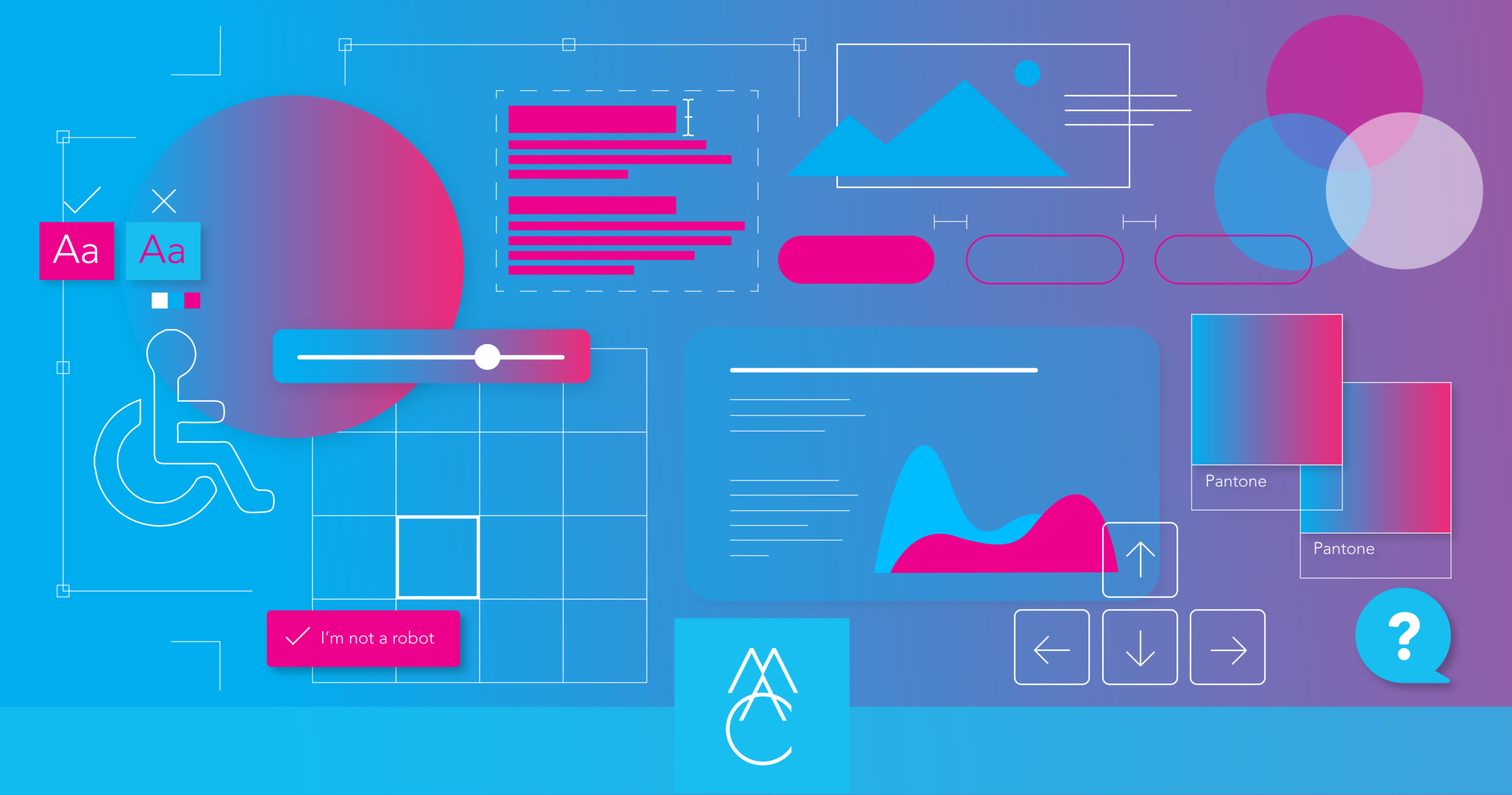
Our team of UX designers, content strategists, and writers collaborated to make Shadowserver’s website easy to use and understand — pairing straightforward, conceptual writing with meaningful illustrations; drafting an intuitive information architecture; and developing user-friendly wireframes built on a solid content strategy. From there, our UI designers brought the interface to life.
Result
Our client is close to its work — so close, it didn’t have the vantage point to build a bridge between the deeply technical work it does, and the critically important, non-technical decision-makers it needs to reach.
With meticulous, iterative research and strategic thinking, the MAC built that bridge.
» Tour the website at shadowserver.org

We created the design, messaging, and website that our client needed to achieve their business objectives and shine a light on their true identity.
What could a powerful new brand and website do for you?
Explore Our ServicesRelated work samples

More Resources
-
Article
WCAG 2.2 Guidelines - What's NewLearn about the latest update in the Web Content Accessibility Guidelines (WCAG) to ensure your website is inclusive to all.
-

Article
Creating a Gen Z-Friendly College Experience (and Website)Thanks to the availability of information at their fingertips, Gen Z evaluates colleges against more criteria than any generation before. In this new article we outline 5 factors to consider when creating a college website...
-

Worksheet
How to track success on your website projectSuccess on your project is as simple as M-A-C (Maintain, Analyze, Correct)!